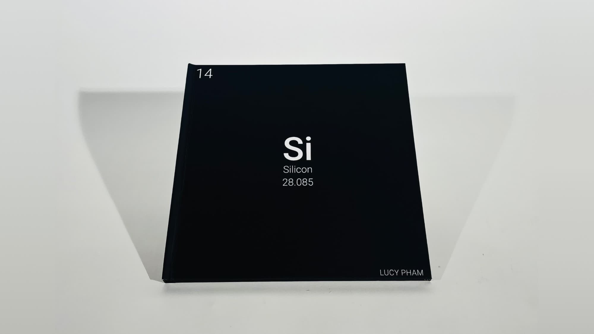
SI: Silicon
Challenge
Under Prof. Gökhan Ersan, I was tasked with creating a coffee table book that would be published by the end of the semester. The main challenge was to create a polished editorial design for a single subject, with navigation built into the design.
Approach
I used a 9 x 9 grid system, custom icons, contact pages, spread planning, and experimental design tools to strengthen the book's visual language and settle my vision for the final printing.
- Duration
- October – December 2025 One semester (~2.5 months)
- My Role
- Designer
- Tools
- Adobe Illustrator, Photoshop, InDesign, Adobe Dimension, QGIS
Structure and Flatplan
Before the first spread was designed, the book was planned three times over.
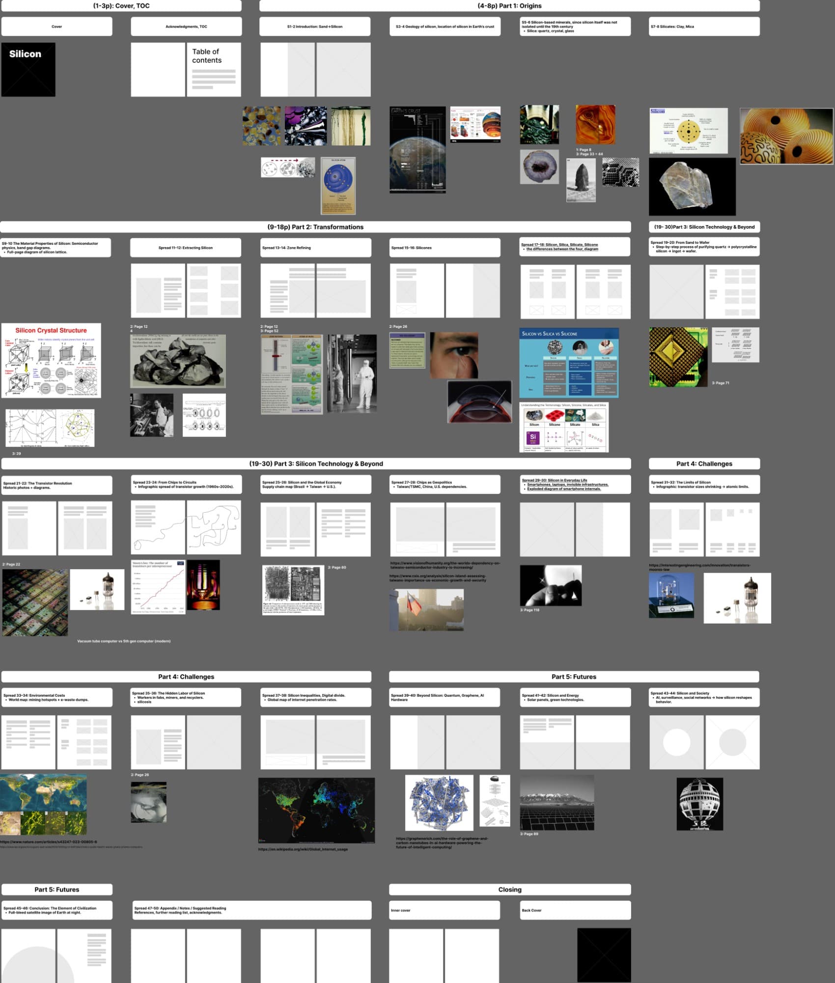
The full 64-page flatplan, mapped spread by spread in Figma before any design began.
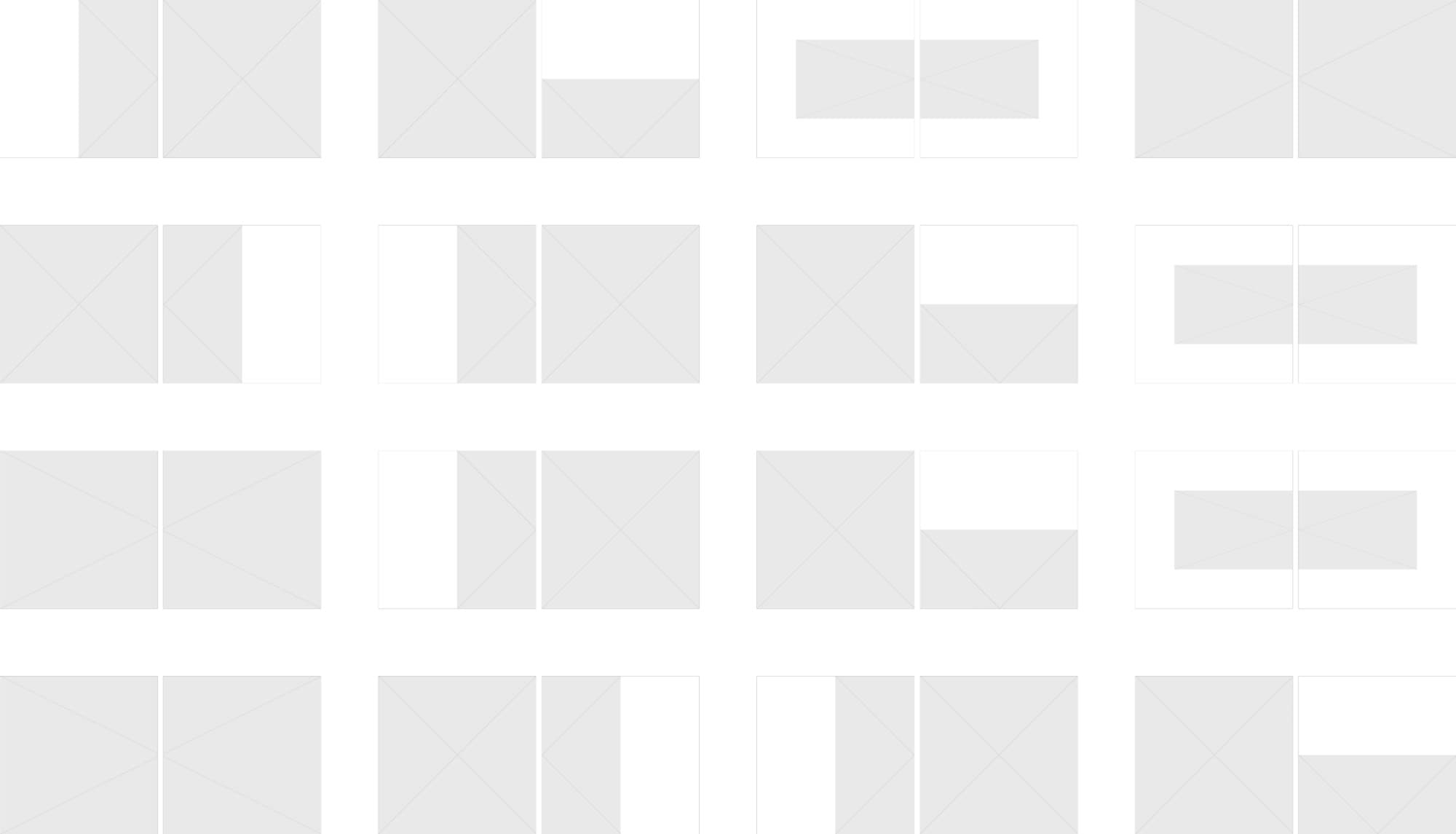
Every spread blocked out in grey before an image or line of copy went in.
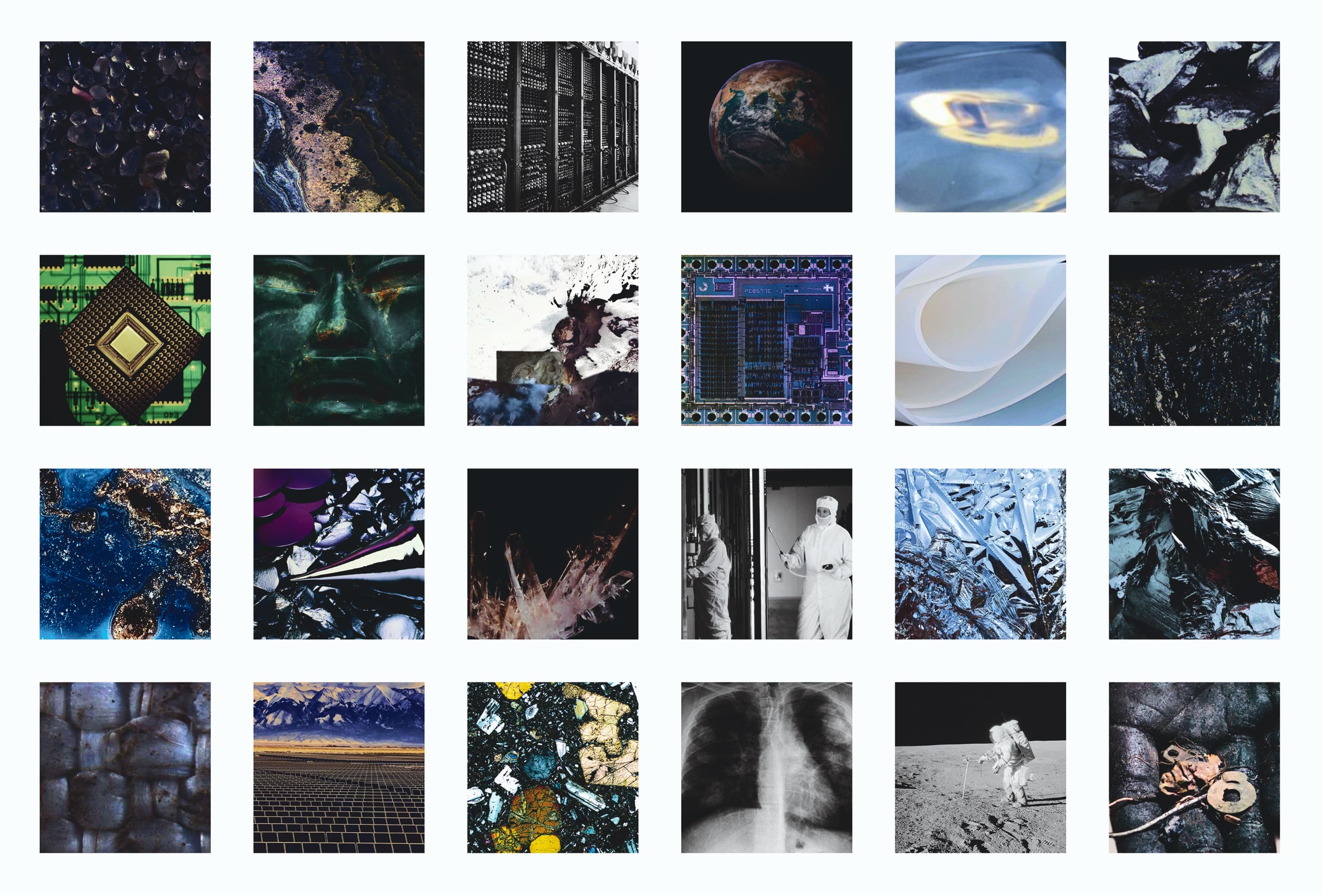
A contact sheet of the visual research that shaped the book's direction.
A Tour Through The Book
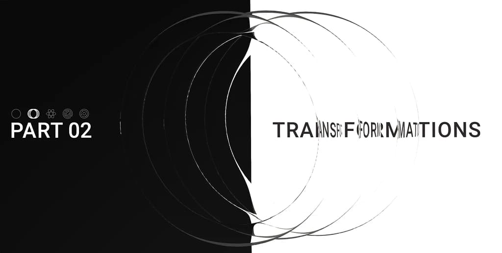
Each part opens on a rendered title page, then moves between full-bleed imagery, diagram spreads, and text pages at the pace the flatplan set.
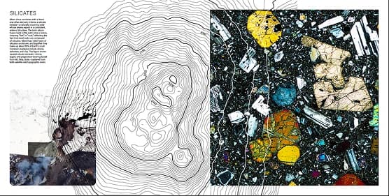
Sand to silicon, the geology of the crust, silica and the silicates.
Special Tools
Two of the things holding the book together are not drawn by hand, and neither is made in the software this project would normally be credited to. Both were skills I picked up mid-semester, specifically because the book needed them.
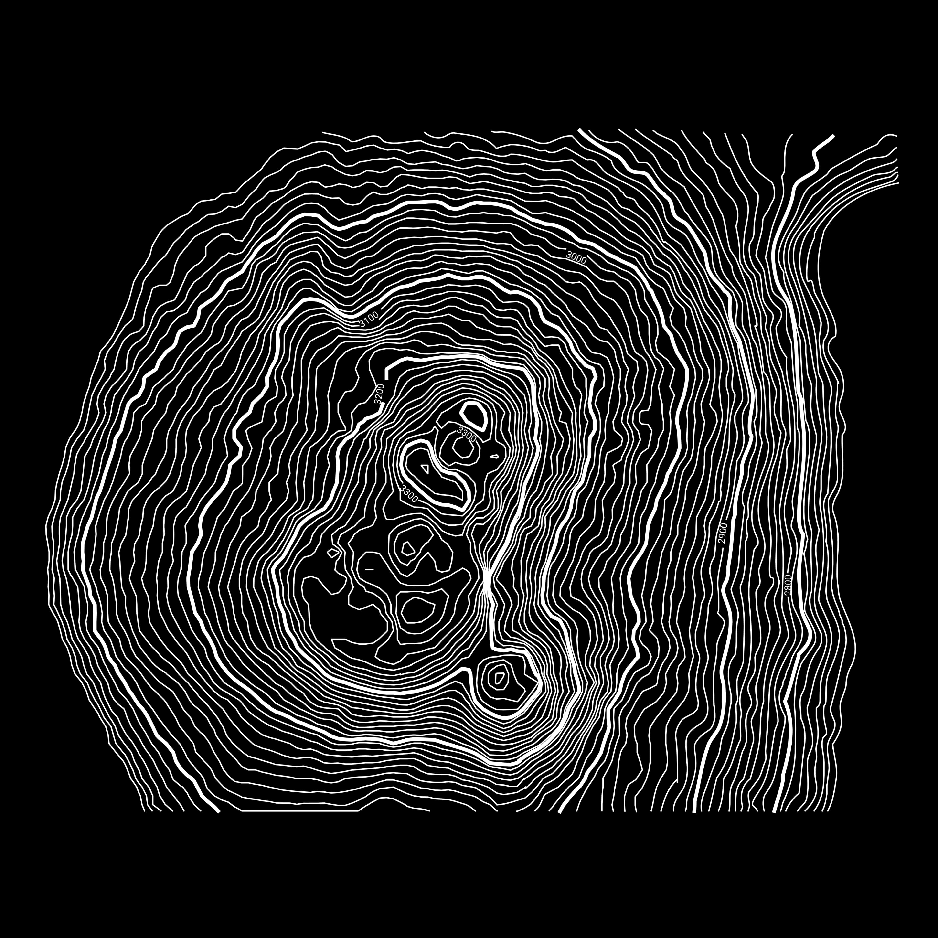
Coding topography in QGIS
The book’s contour line work is generated from real elevation data of Mt. Etna in QGIS, then exported and rebuilt as clean vectors in Adobe Illustrator to match the book’s grid and type.
Rendering the navigation icons in 3D
The flat navigational marks also appear as 3D renders built in Adobe Dimension at each part’s title page, giving material, lighting, and depth to a mark that otherwise only works flat.


Reflection
Systems beat spreads
Settling the grid, type, and icon language first turned 64 pages from an impossible workload into a sequence of solvable compositions.
Learn the tool the idea needs
QGIS and Dimension were both outside the Adobe workflow I knew. Picking them up mid-semester was faster than compromising the idea to fit the software I already had.
Iconography is information design
Treating the icons as navigation gave the book a structure a reader can follow without being told about it.