Design
Giving Admins Clarity
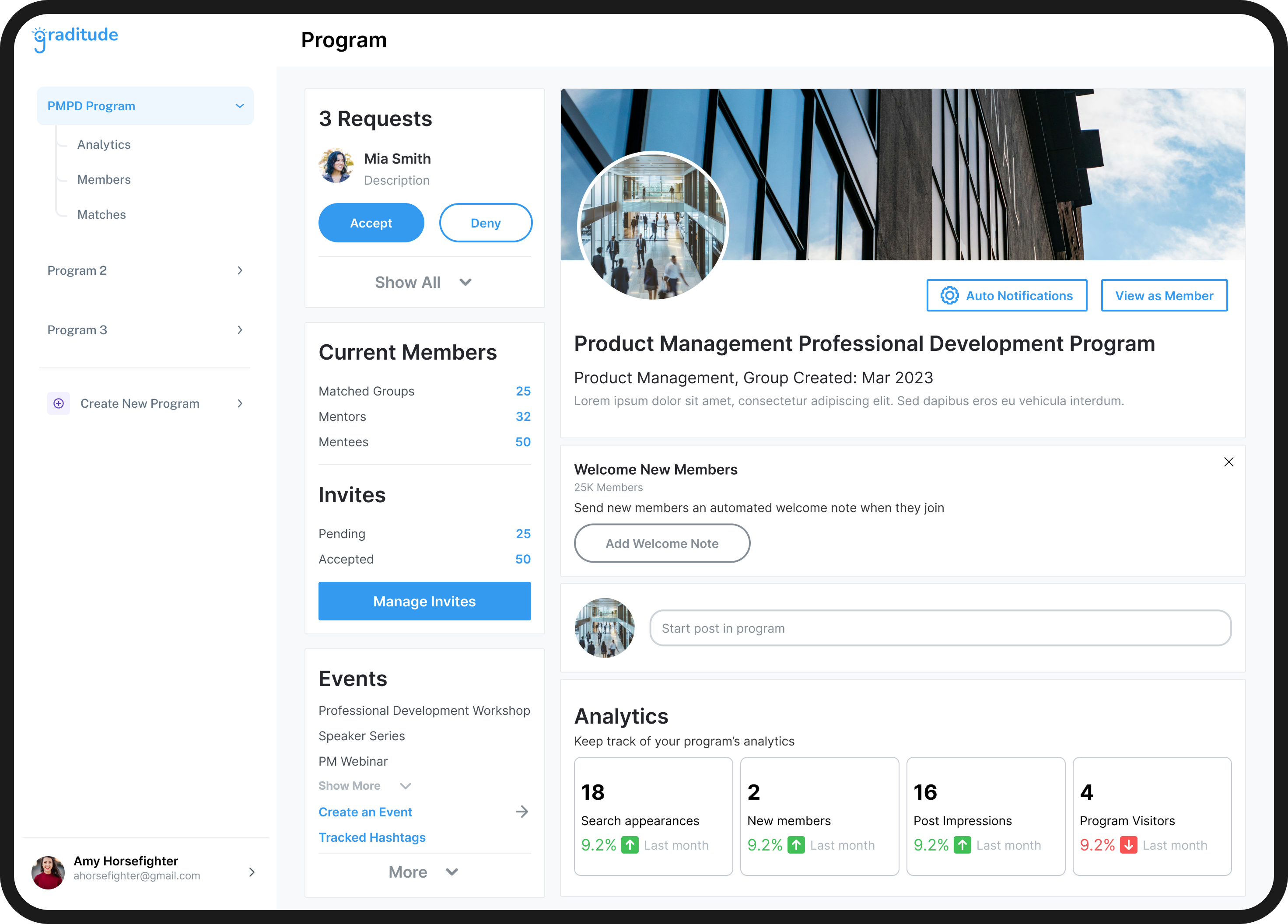
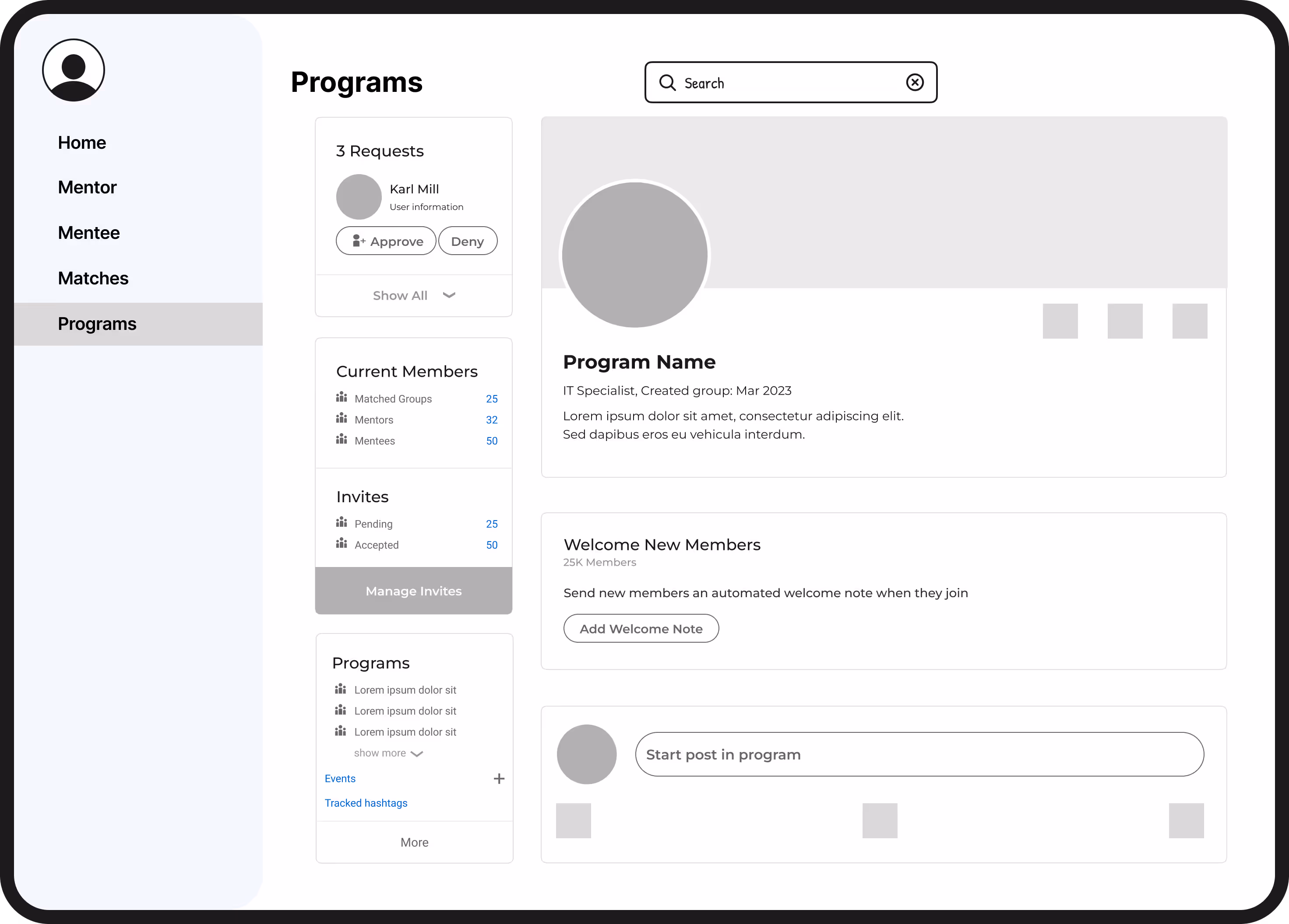
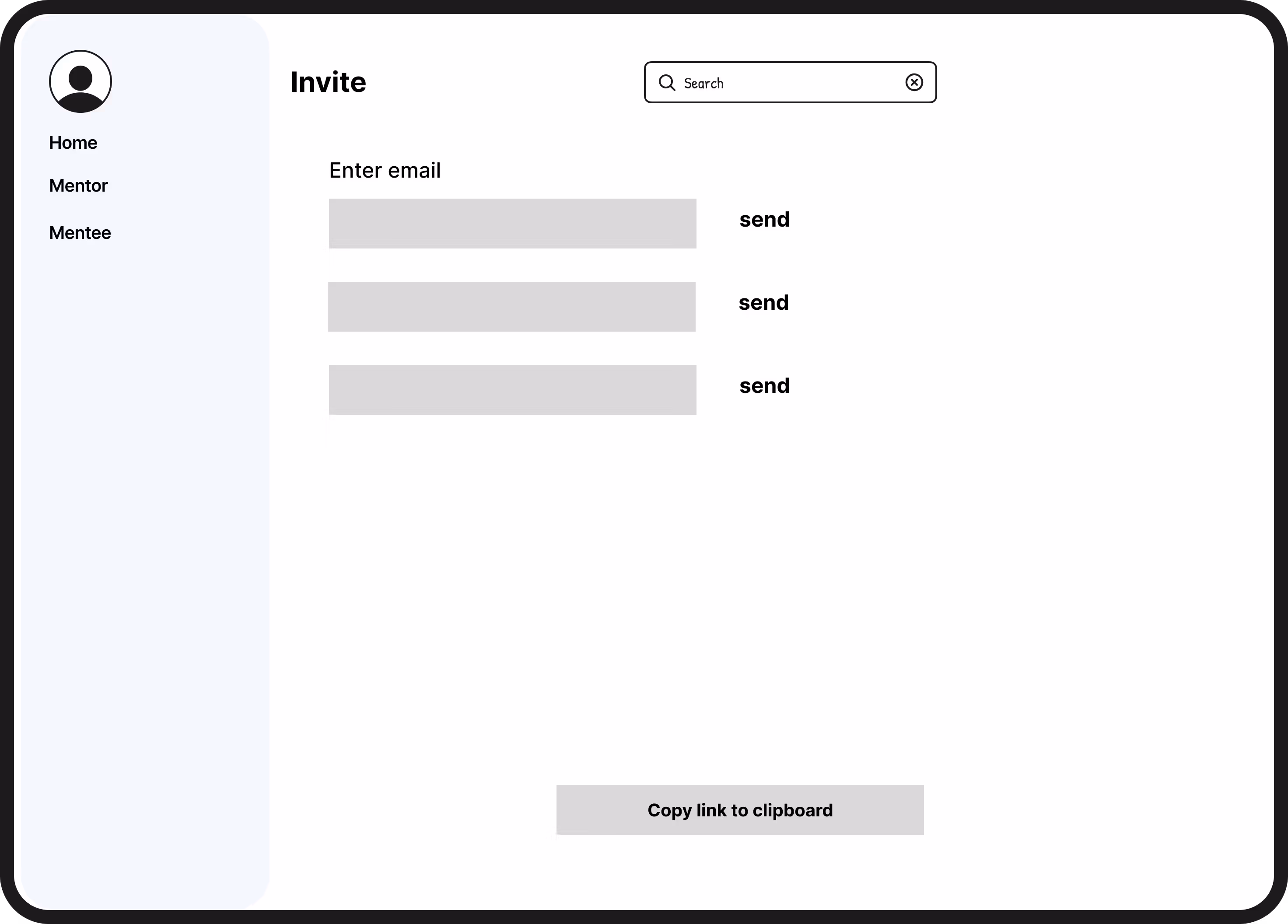
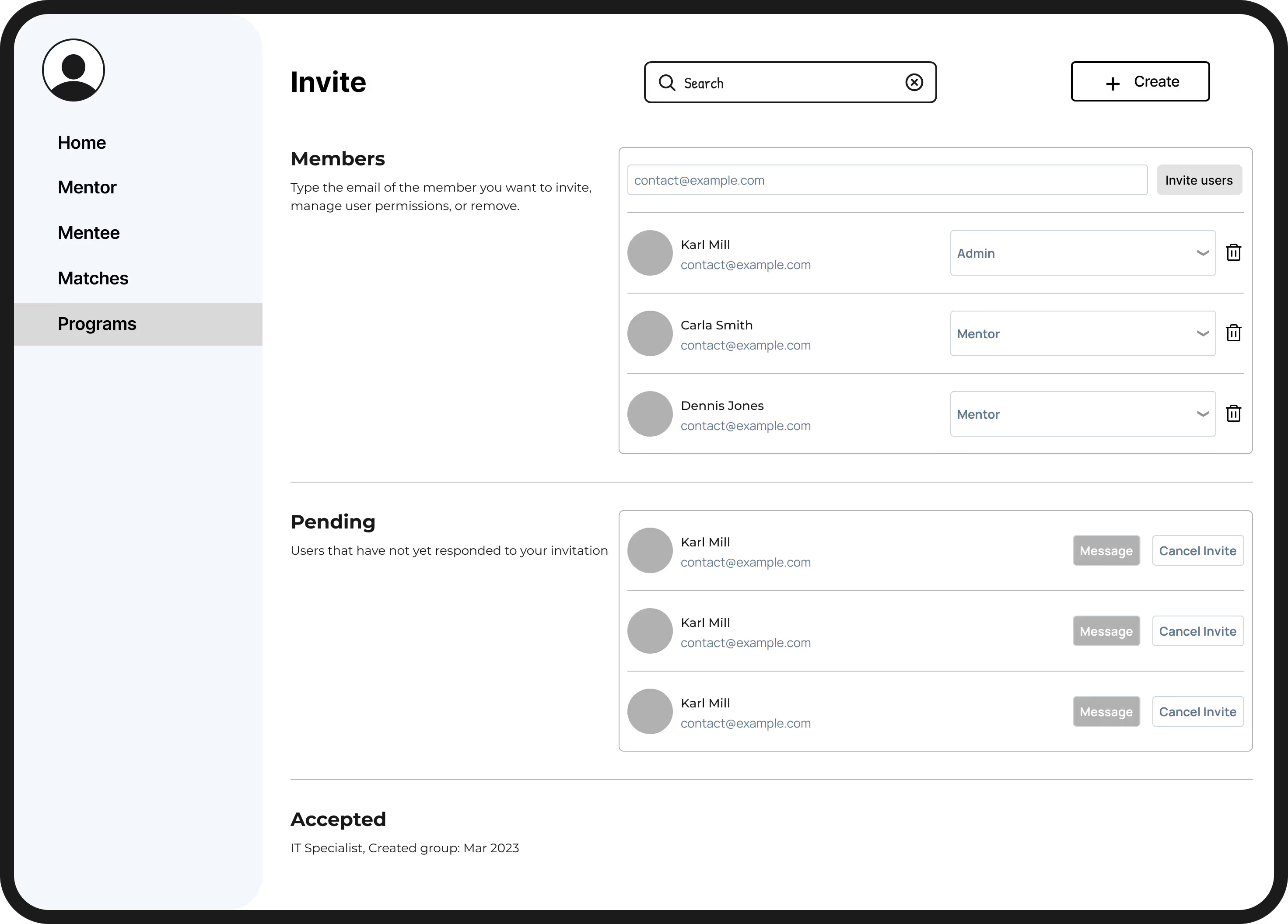
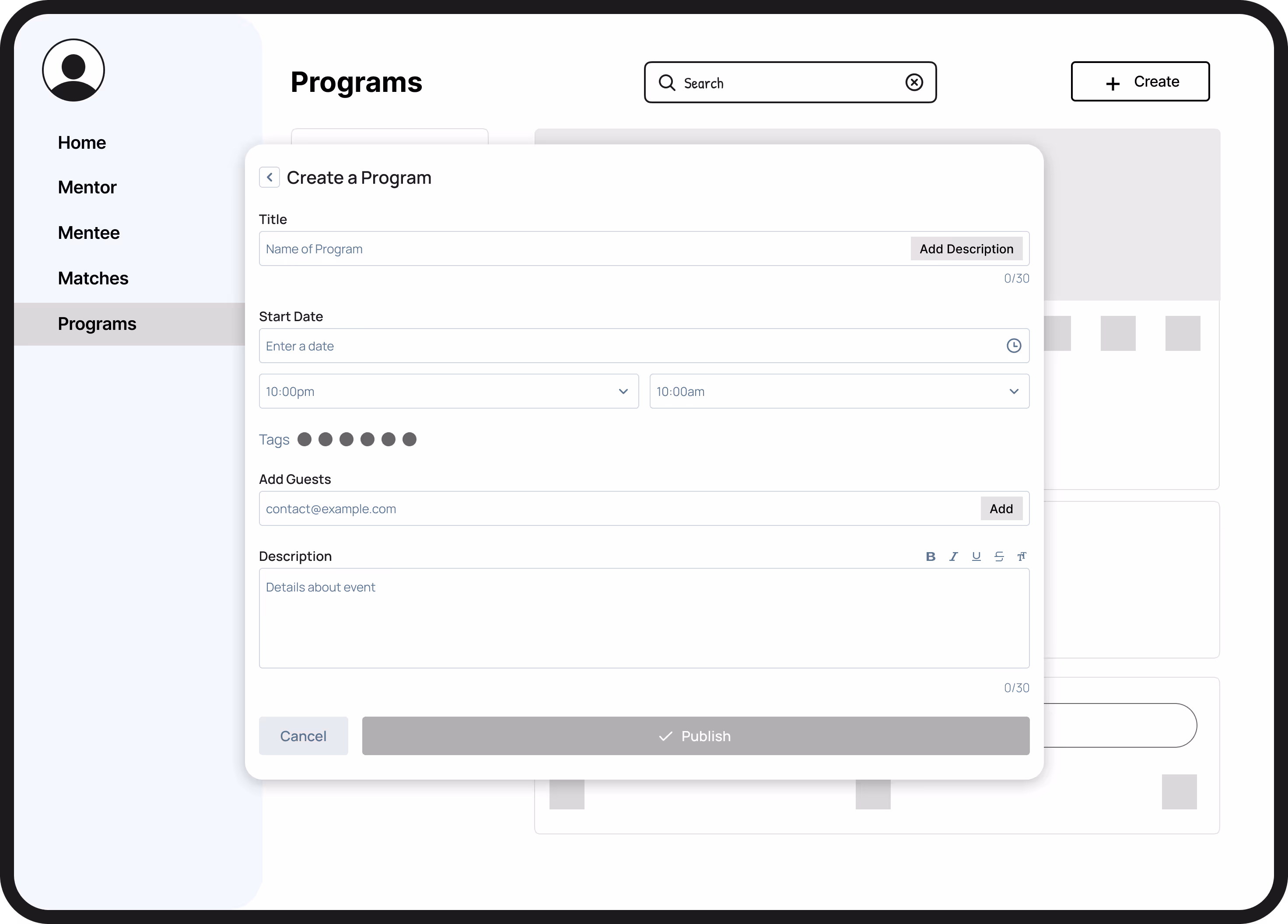
Through my dashboard design, admins can now create new programs, engage with their programs' members, and view selected statistics to keep track of their programs' progress.

.avif)

.webp)
.avif)
.avif)
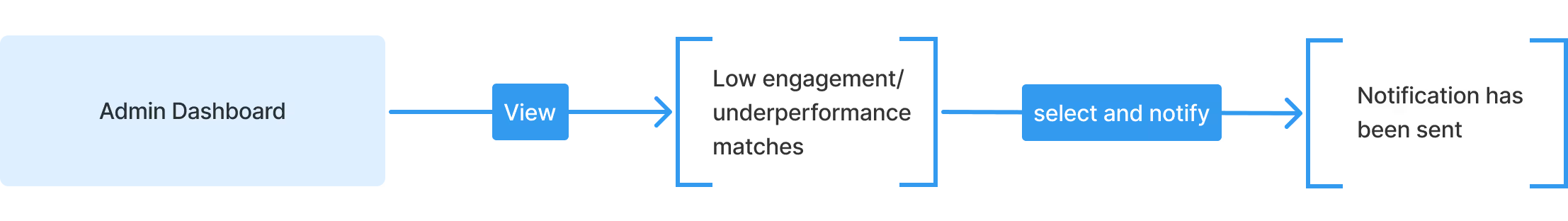
Our "Nudge" flow allows admins to quickly identify low-engagement or underperforming mentor–mentee matches from the Admin Dashboard, select them, and send targeted notifications. By streamlining the process into just a few steps, admins can efficiently re-engage pairs before progress stalls, which ensure that mentorship programs stay active and productive.
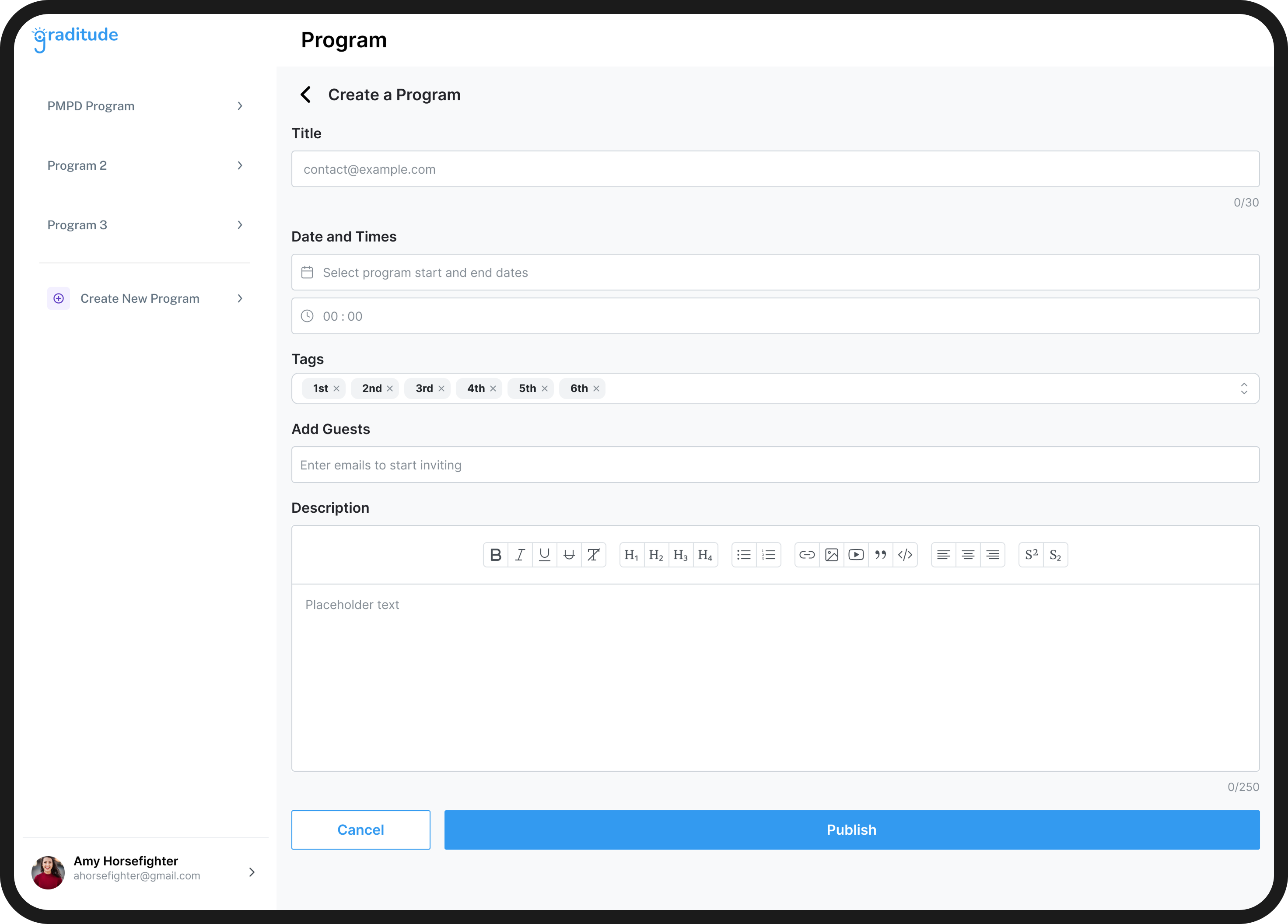
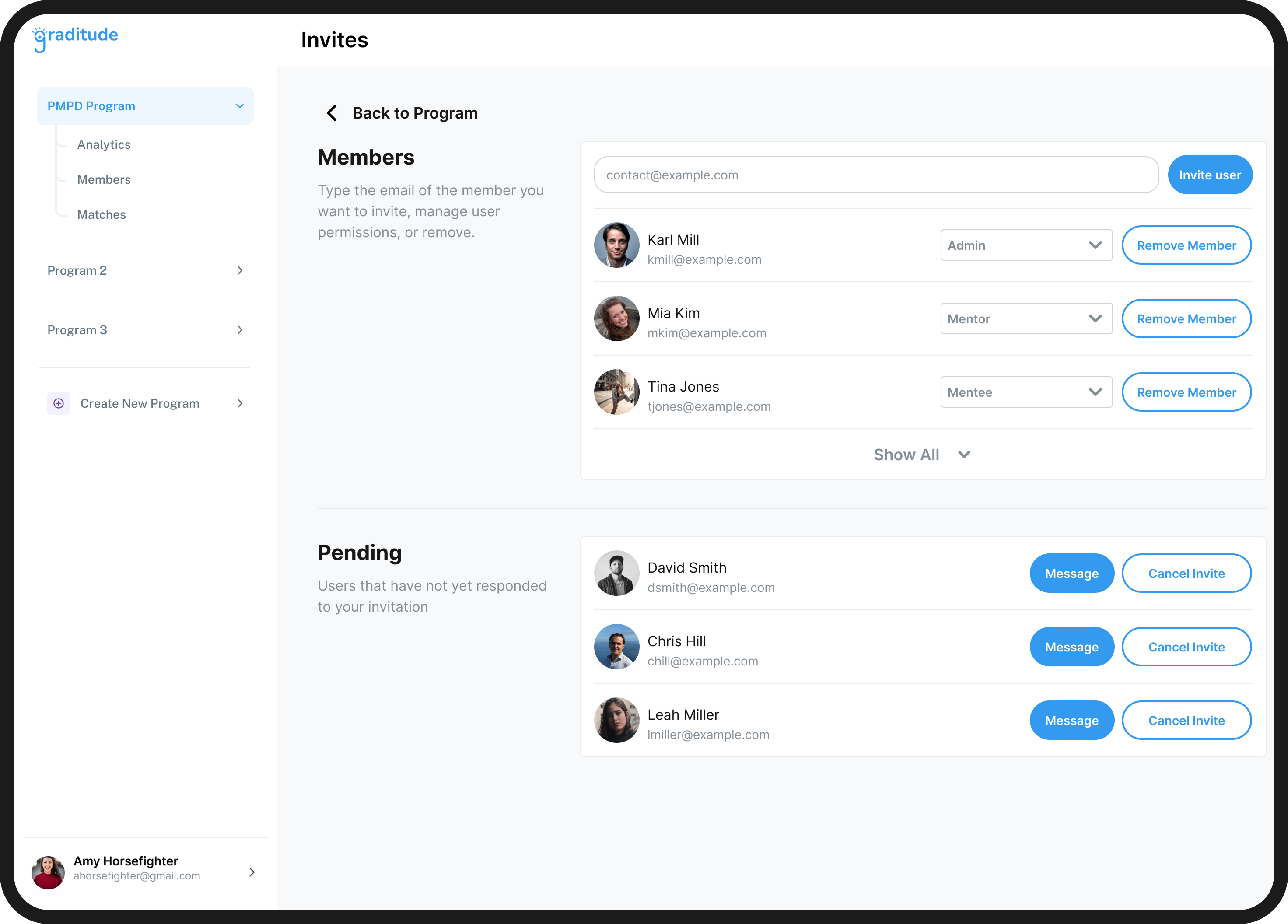
To further define our scope and ensure that our plan was a comprehensive solution for Graditude's mission of providing admins with the tools they need to manage mentee/mentor matches, I took ownership over the main dashboard, inviting new members flow, creating new programs flow, and making sure that we had clear action items before and after our weekly meetings.
.avif)
After we presented our low-fidelity wireframes to the CEO, we designed for gaps in our designs, including:
Enhancing the side nav bar to include not only members and mentors, but also giving admins access to programs
.avif)
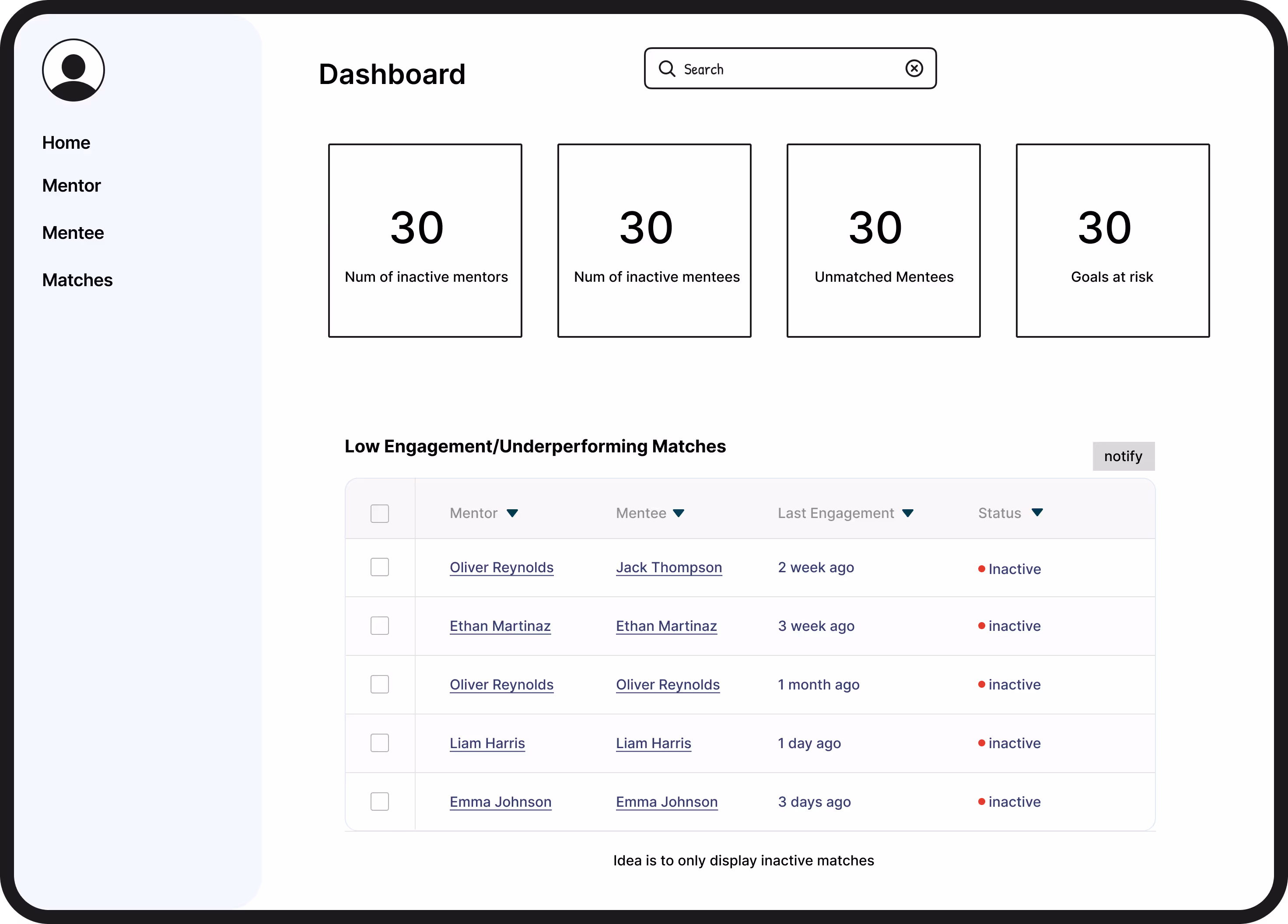
Including more positive metrics such as total numbers, active participation rates, and overall satisfaction instead of purely negative such as # of inactive members
.avif)
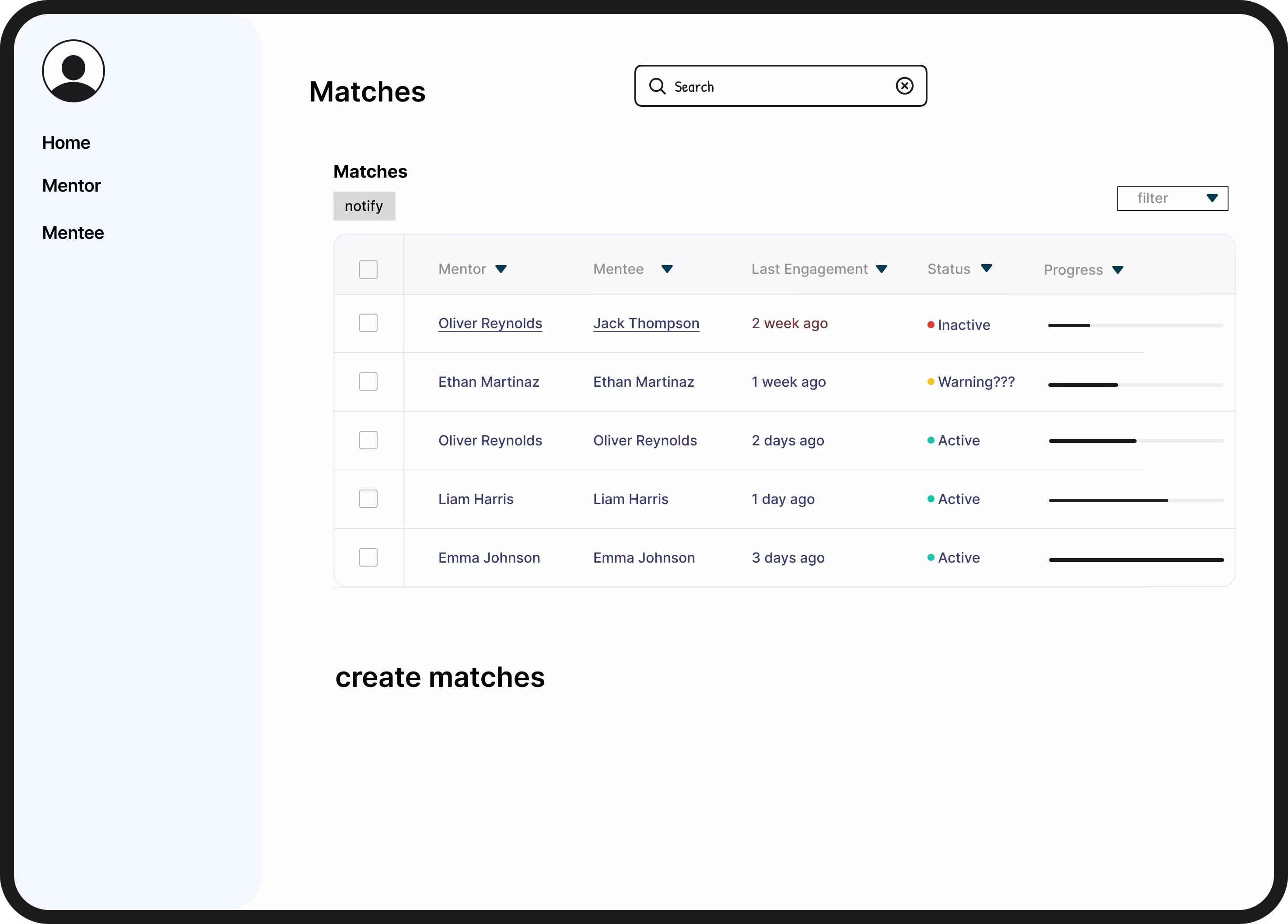
Consolidating features such as analytics and managing invites on one page to enable quicker decision-making for admins
.avif)
Through my dashboard design, admins can now create new programs, engage with their programs' members, and view selected statistics to keep track of their programs' progress.
For a design to be successful, I needed to balance what the CEO wanted, past user research, and usability test results. What helped me the most was sorting stakeholder/business and users' needs and connecting them based on pain points and objectives of the tool.
Since this was a remote internship across multiple time zones, organization was key to the project’s success. By managing action items, coordinating meetings, and updating the CEO weekly, I kept my team productive despite being 2000+ miles apart!
Having only worked on consumer-facing products, designing for admins was a refreshing new challenge. This project really pushed me to draw on my own club leadership and internal tool experience to better empathize with admins' unique needs.
.png)

