.png)

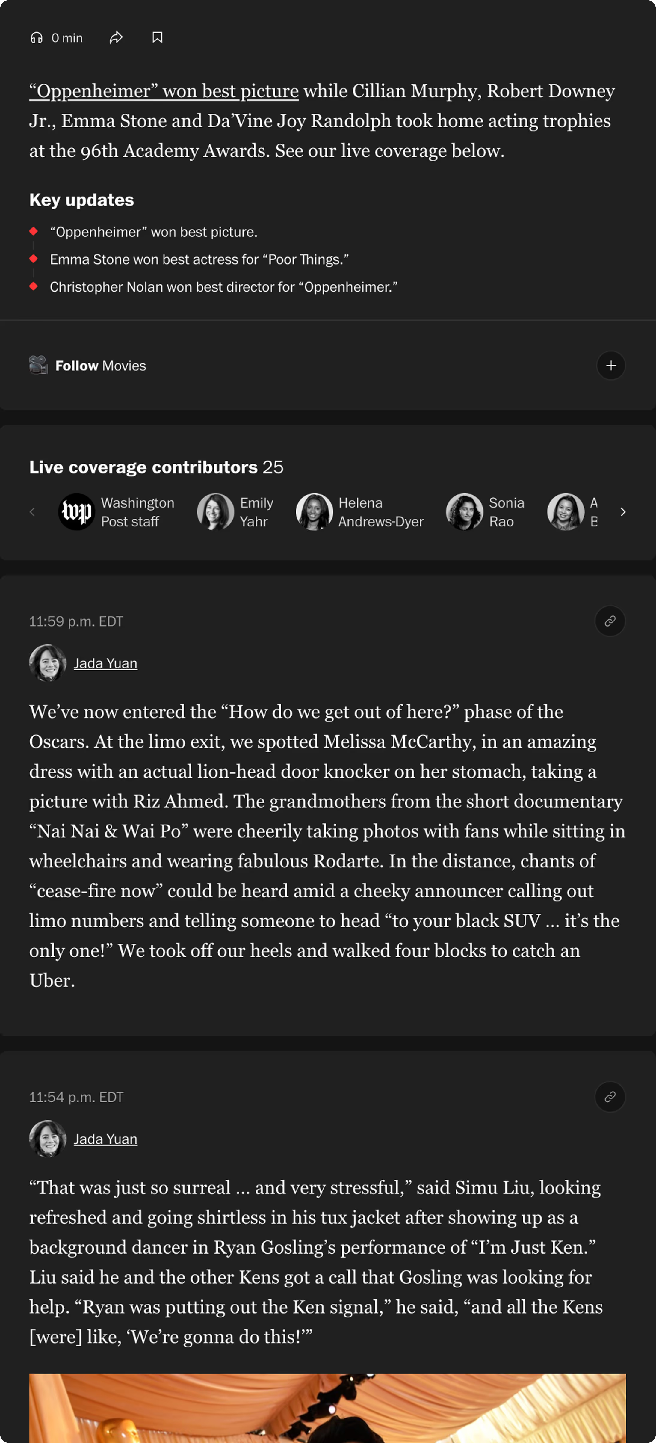
With the Live Activity Feeds (LUFs), contributors are not limited to traditional article formatting, allowing for quick posts designed as cards that readers can follow. To understand how to design the iOS Live Activity, I needed to understand LUFs' anatomy.
Users often open one push notification but rarely return to check for updates, signaling low sustained attention.
Too many alerts during live events cause users to mute or disable notifications entirely, decreasing engagement.
They want to understand what’s happening at a glance without unlocking their phone or scrolling through feeds.
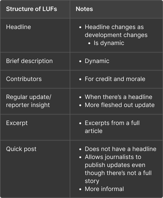
I dissected existing LUF structure: dynamic headlines, dynamic descriptions, contributor credits, reporter insights, article excerpts, and quick posts to understand the content I was designing for.
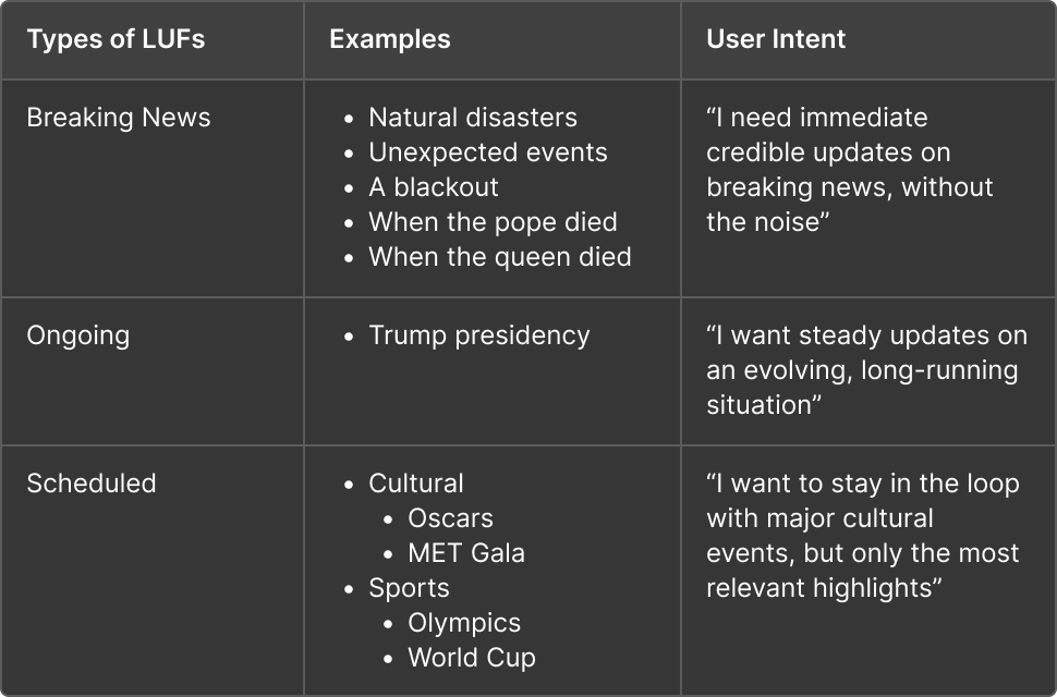
I also defined LUF categories to further breakdown which type of news would work with a live activity template in addition to how users would interact with different LUF live activities.
The 2024 Election prototype served as the baseline for my design. Though it generated high engagement (26% click-through), it did require heavy manual tagging by journalists. Since the process was not scalable, I worked alongside the PM intern to integrate an LLM-based classifier to automate surfacing urgent, high-salience posts to reduce noise.
My design needed to be adaptable and act as a sort of template for different formats and combinations of quantitative and qualitative data.
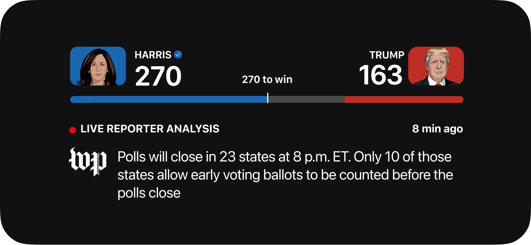
The iOS Live Activity requirements was an added constraint throughout my design process.
Designing for such a small screen with areas where UI would not show or would be rejected during the final Apple approval process gave me a unique challenge to solve.
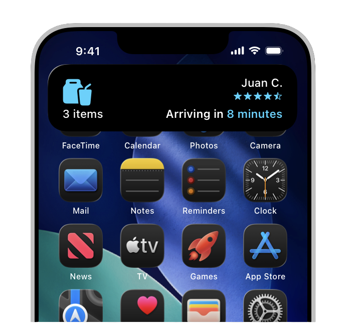
My early concepts primarily focused on exploring how much information could fit in the compact format and the variety of data, taking note of constraints with the display as well as the 8 hour limit that a live activity appears on the user's screen.
.png)

For my initial design, I focused on exploring different ways to display the live update title, time stamps, and pieces of content while utilizing the Post's components in the existing Figma libraries.
I learned to rapidly prototype new iterations to better prioritize visual hierarchy at this conceptual design stage.
I used the Hurricane Ian story as the example use case to populate content.
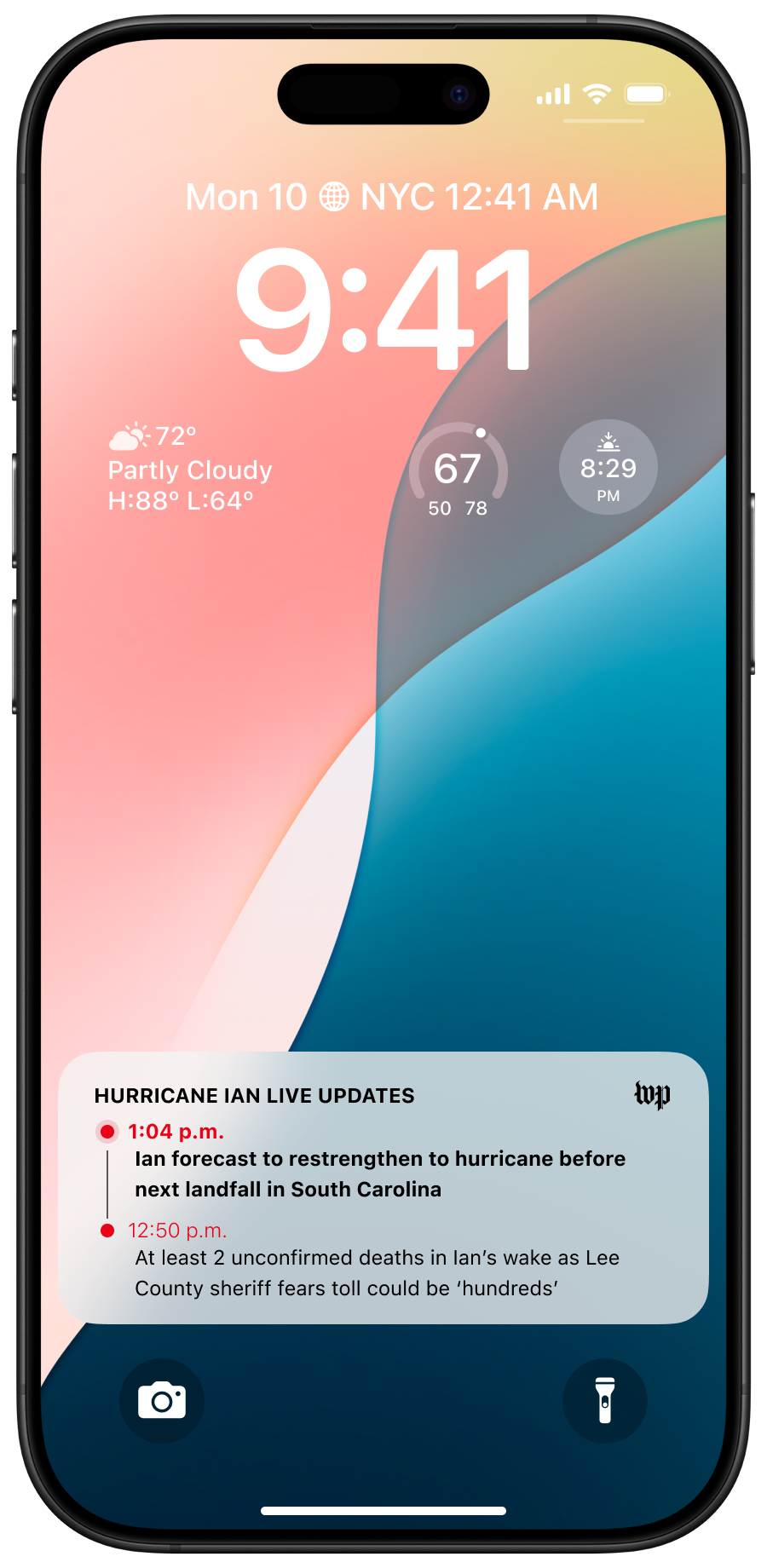
.png)
After feedback from product and design leadership, I implemented the following changes:
Optimized scalability:
Created a flexible component system that could accommodate event-specific visuals (e.g., cultural vs. political coverage) while maintaining consistency.
Defined interaction model: Clarified transitions from lock screen to app view using timestamped anchors and subtle motion cues.
.png)
.png)
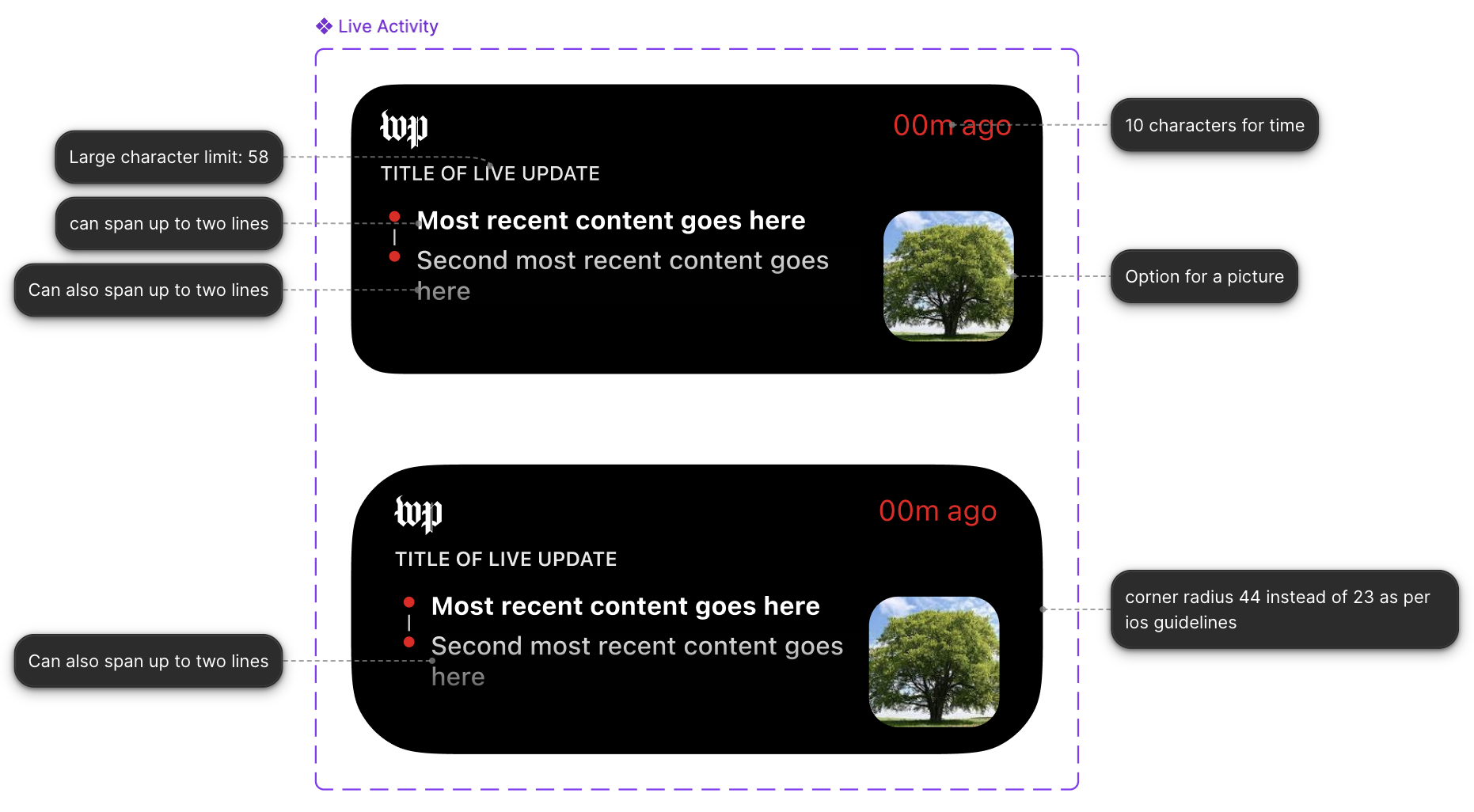
Collaboration with the iOS engineering team that worked on the elections live activities revealed technical limitations in Live Activity height, interactivity, and refresh rates. To maintain performance and compliance, I established modular zones for the headline, timestamp, and update source that scale within iOS boundaries. These insights also informed future LUF integrations, ensuring visual adaptability across compact and expanded states.
.png)
.png)
To support The Post’s diverse storytelling, I built a template design system that balanced scalability with creative freedom. Each template could adapt to event type (breaking, ongoing, or scheduled) and editorial tone while leaving space for visual experimentation by graphic artists. This framework ensures consistent brand presence across all Live Activities while allowing for event-specific customization.
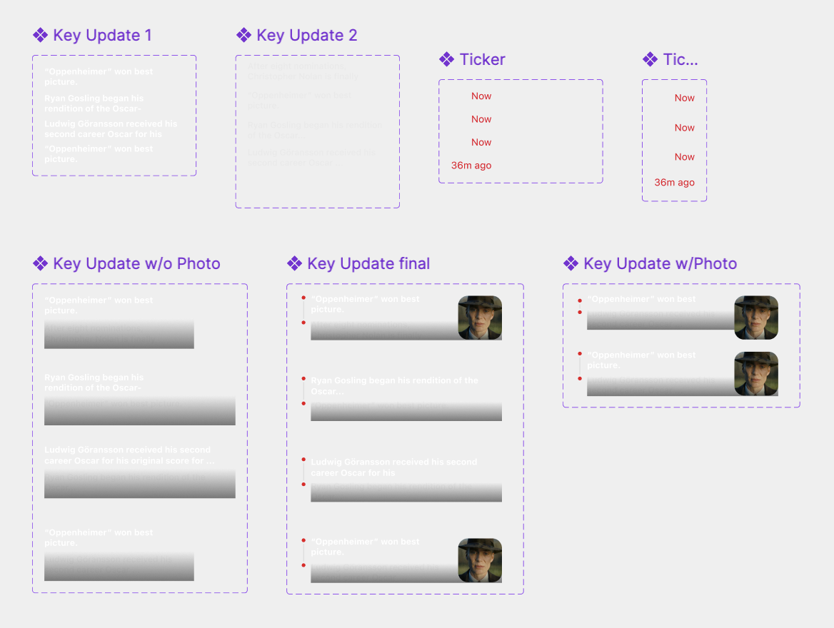
I learned how to prototype smooth motion interactions by making my own local components for transitional states within the live activity.
These animations would allow users to better understand when content has been updated in real time, helping them maintain context within their experience.
In alignment with The Washington Post’s initiative to expand real-time, mobile-first experiences, I presented the Live Activity Feed prototype to the Content XP leadership, alongside other newsroom and product teams exploring engagement-driven solutions.
This was my third project during my internship at The Post, and it challenged me to move beyond execution and think like a product strategist. More than just meeting the MVP outlined in the PRD, I learned how to anticipate future scalability and design with newsroom, engineering, and audience needs in mind. Some of my key takeaways include:
Working with engineers from previous Live Activities showed how design constraints can spark innovation. Understanding iOS limits early (height, refresh, and interactivity) helped me design smarter and advocate for feasibility.
From early sketches to stakeholder reviews, every round of critique refined the clarity and purpose of the design. I learned that iteration is less about perfection and more about progressive alignment with the product, the team, and the user.
The PRD defined a minimum viable product, and I learned to treat it as a foundation, not a finish line. By proposing flexible templates and scalable logic, I built a framework ready to evolve with new events and future use cases.